Initial Drawing Styles
I have to admit that I struggled a little with starting the drawing for this project. It took me a very long time to start, but once I did, it just flew out of me, so much so, I miss drawing right now. The whole project is about combining several different drawing styles together, so exploring these are crucial to the layering and collaging style I want.
Mark Making
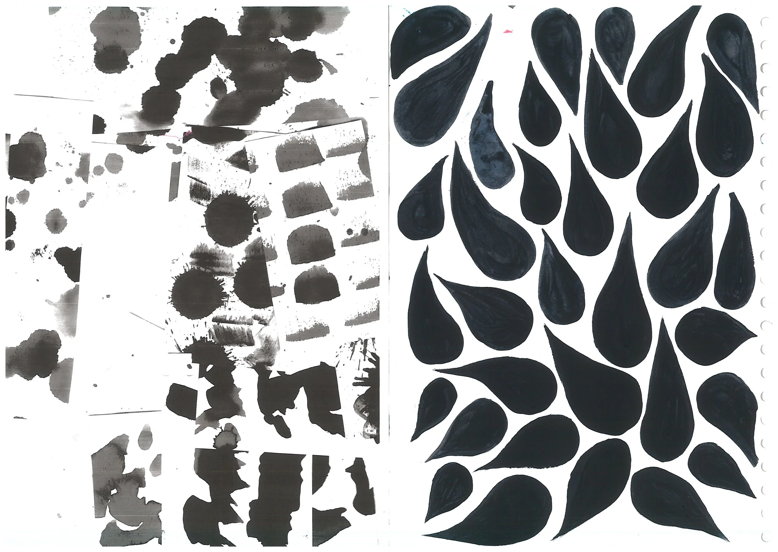
Drawing textures were a good start to drawing elements of the lane. My favourite mark I created was the paint splattered spot. I think this will be good to reflect into CAD embroidery as they have the detail as well as opacity to them. This could prove effective on top of intensely patterned fabric to add layers as well as differences in opacity too.
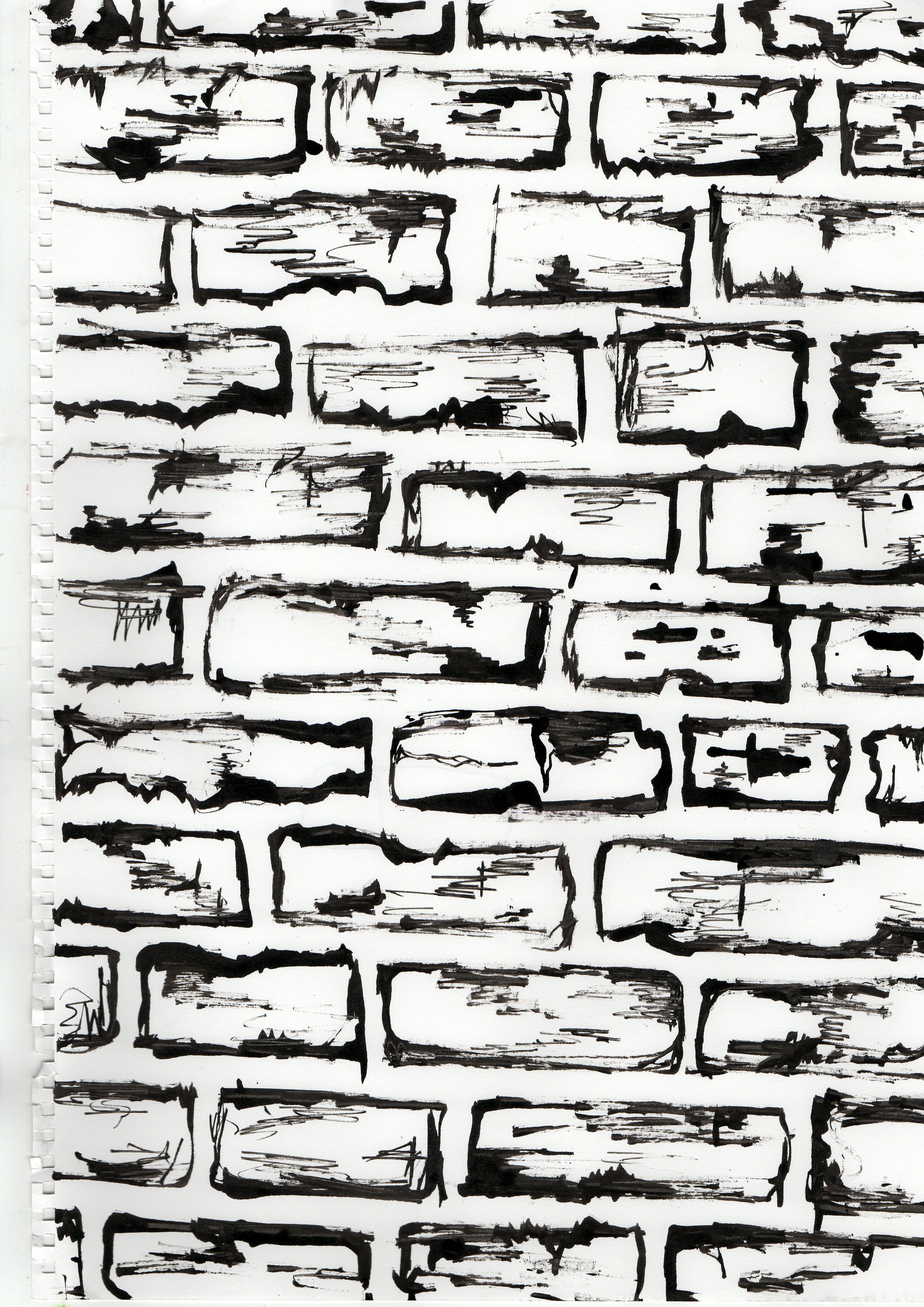
I also developed these marks into brick patterns too. By experimenting with different marks to illustrate the bricks, I was able to choose which drawing was my favourite. I decided my favourite drawing were the scratchy outlines of the bricks as it portrays the texture of the bricks as well as the shape.
Faces
I initially looked at drawing faces in the style of a tile I saw, but realised that it was too much of a pastiche of style. I realised that I could use my initial drawings when collaging and layering so I decided to cut them up and experiment with them. However, I realised that I do not like the style of these collages and will probably not develop them further. I think I do not like the collages due to the colours used as they are not accurate to my colour palette.
Original Graffiti
My initial graffiti style involved a lot of paint scraping and I eventually developed this further. From doing several paint scrapes I realised that I love the texture of these marks. However, the initial drawings were not done using the final colour palette that I have decided on. I did also use these papers in other collaging designs.
Original Collages
My original collages consisted of using magazine clippings as well as remnants from my own drawings. I layered up photocopies of my work and tore them up to create the textured wall effect I wanted. I also experimented with adding paint and stickers on top to add to the layering effect. While these collages represent some elements of the lane, I realised that they still need some development. I can also use my collage skills to develop new collages and keep these ones as initial drawings.
Street Signs
From walking down the lane, I realised that typography and text are key to the aesthetic of the lane. From the political posters and street art to the signs showing the street names or even old businesses all add to the feel and atmosphere of the lane.
I realised from this that it was important to include text in my collection. I have even started creating screens with text on them. I think that text will be good for placement prints that could be used on the legs or as a statement on a back of a jacket.


